
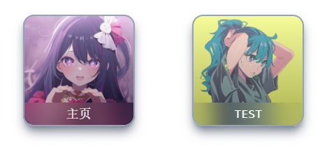
先上效果图

代码如下:
<script setup>
import { ref } from 'vue'

const props = defineProps({
    title: String,      //标题
    siteUrl: String,    //点击跳转Url
    imageUrl: String,   //背景图片Url
})

const x = ref(0)        //卡片X轴旋转角度
const y = ref(0)        //卡片Y轴旋转角度
const z = ref(1)        //卡片放大倍数
const light = ref(0)    //高光角度

/**
 * 卡片随鼠标3D效果
 * @param e
 */
function onMousemove(e) {
    // 获取dom元素
    let box = e.target.getBoundingClientRect();
    // 获取鼠标位置并计算卡片旋转角度
    y.value = (e.clientX - box.x - (box.width / 2)) / 10 * -1;
    x.value = (e.clientY - box.y - (box.height / 2)) / 10;
    //卡片放大
    z.value = 1.1;
    //计算高光
    light.value = (box.height * box.y) / 60;
}

/**
 * 鼠标离开时复原
 * @param e
 */
function onMouseleave(e) {
    // 鼠标离开时还原
    x.value = y.value = 0;
    z.value = 1;
    light.value = 0;
}
</script>

<template>
    <!-- 卡片层 -->
    <a class="card h-40 w-40 m-10 shadow-lg shadow-gray-500 rounded-2xl" @mousemove="onMousemove" @mouseleave="onMouseleave"
        :href="siteUrl" target="_blank" :style="{ transform: `rotateX(${x}deg) rotateY(${y}deg) scale(${z})` }">

        <!-- 渐变层 -->
        <div class="card-shine z-10 absolute top-0 bottom-0 left-0 right-0 rounded-2xl border-2 border-solid border-slate-400"
            :style="{ background: `linear-gradient(${light}deg,rgba(0,0,0,0.3),rgba(241,241,241,0.3))` }"></div>

        <!-- 阴影层 -->
        <div class="card-shadow absolute shadow-2xl shadow-slate-50 opacity-25"></div>

        <!-- 图片层 -->
        <div class="card-layer -z-10 relative w-full h-full rounded-2xl bg-cover"
            :style="{ backgroundImage: `url(${imageUrl})` }"></div>

        <!-- 标题 -->
        <div class="card-title z-20 absolute bottom-0.5 left-0.5 right-0.5 backdrop-blur-lg rounded-b-2xl">
            <span class="text-pearly text-lg font-mono">{{ title }}</span>
        </div>

    </a>
</template>

<style scoped>
.card {
    transform-style: preserve-3d;
    perspective: 200px;
    transition: 50ms all ease;
}

.card-shadow {
    top: 5%;
    left: 5%;
    width: 90%;
    height: 90%;
}

.card-title {
    height: 20%;
    /* Make Text Center */
    display: flex;
    align-items: center;
    justify-content: center;
}
</style>
使用方法:
直接使用:<Card title="标题" siteUrl="跳转URL" imageUrl="图片URL"/>
列表渲染:
<script setup>
import Card from "./Card.vue";

// load objects from somewhere
const sites = [
    {
        'id': '1',
        'title': 'Title',
        'siteUrl': 'https://www.whitepeach.top',
        'imageUrl': 'https://t.alcy.cc/tx',
    },
    {
        'id': '2',
        'title': 'TEST',
        'siteUrl': 'https://www.whitepeach.top',
        'imageUrl': 'https://t.alcy.cc/tx',
    },
]
</script>

<template>
    <div class="flex flex-wrap justify-evenly items-center content-evenly">
        <!-- 列表渲染 -->
        <Card v-for="(site, index) in sites" :key="site.id" :title="site.title" :siteUrl="site.siteUrl"
            :imageUrl="site.imageUrl" />

    </div>
</template>

<style></style>
然后就大功告成啦
遇到问题欢迎在评论区留言
Comments NOTHING